Thursday 21 November 2013
Planning
Group Mood Board
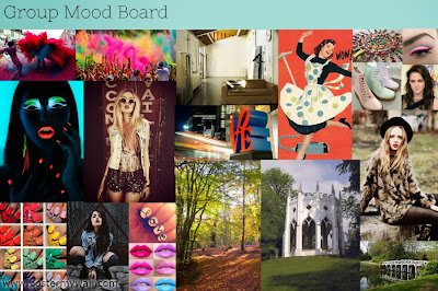 Today we created a mood board as a group in order to merge all of our ideas and make sure our creative outlooks for the video were the same. The main themes we all settled on were having bright costume and make-up (e.g. nails, lips, eyeliner), the fashion style of the video to be soft grunge (quite edgy-looking but still mainstream clothes (not too alternative), the glow paint to be quite artistic and creative looking, the paint dust to be bold, colorful and fun, and the locations to be picturesque.


Sunday 17 November 2013
Location Spotting
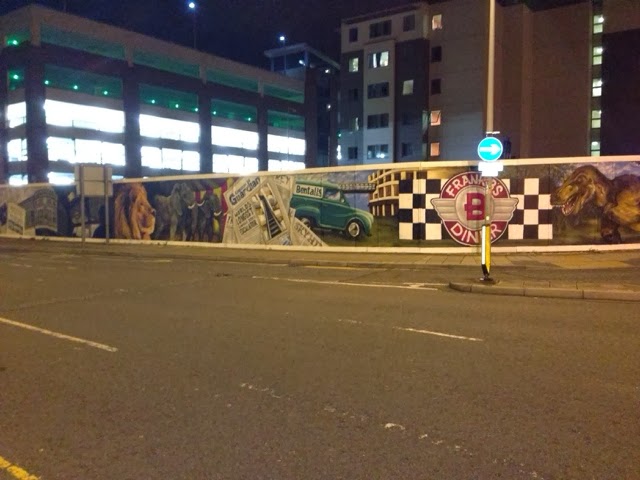
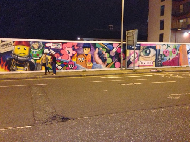
While out in Kingston we spotted a location which might be good to film at as it shows bright and colorful images of well know, popular themes (e.g. my little pony, lego etc) and therefore would link into our video by keeping it bright and vibrant and appealing to the pop audience who would recognize and identify with the images.
Saturday 16 November 2013
Cast photos - Lead Singer
We chose to cast Katy Williamson as the main artist as she has the typical pop artist look (slim, beautiful, fashionable etc.). Katy has also had previous experience with photo shoots and being on camera and therefore we think she would be a charismatic, photogenic and cooperative character to shoot, which is ideal.
Friday 15 November 2013
Planning
Today in class we continued work on the storyboard. We decided to get down all of our ideas for shots or sequences that we think would be effective and then try to order them and merge them together, rather than doing one linear storyboard for the whole thing as it allows us to be more creative and stop thinking in a narrative based mind set in that one shot must follow another logically. Therefore allowing us to properly brainstorm each section and how they would link together in a creative fun music video.

Wednesday 13 November 2013
Pitch
Our concept for the music video is based on the narrative of the song; a couple in which the female is fed up of the relationship and has gone past caring. This links to the main lyrics of the song 'I got this feeling on a summer day when you were gone...' by representing a clear image of the referred to couple. Our video will be performance based with a fragmented narrative, this is because although we want to keep the video visually interesting and fast paced, we feel there must be some sort of narrative behind it in order to provide sufficient meaning to the song.
 The video will roughly consist of 3 parts, an opening in which we see the character in the kitchen styled as a 1950s housewife serving tea, the character will then begin smashing plates and ripping her apron off. This is to hint at the relationship between her and her boyfriend, in that she is fed up. We chose to do an opening as this is a common feature in pop videos today and we wanted to stick with the conventions of the genre. Furthermore, in the opening we are trying to play with themes which are big topics at the moment like the idea of patriarchy and voyeurism which show the woman being objectified and seen to serve men, our idea could further be interpreted not just as the female being fed up of the relationship but how society is trying to push back against the dominating male figure.

 The second main part to the video will be the powder paint idea which has been a key feature in all of our planning from the very beginning. We plan to have the powder paint come in around the first chorus of 'I don't care...' as we think this will be very eye catching to the viewer and emphasise how the character doesn't care anymore, in that she's getting messy and having fun and couldn't care less, which links in with the lyrics. We had a few specific ideas for shots to be used in this section, for example, the artist would flip her hair forward and then the camera would do a 360 around her before loads of people come into shot and throw paint at her. We also thought of playing with fast forward and slow motion in editing at these parts to create a contrast and captivate the audiences attention (e.g. speed up the footage as a character is about to throw the paint and then slow it down as the paint is mid air). Furthermore we thought it may also look good to use reverse in the section by making it look as if the paint is being taken off the characters (this may be a good way to end the video; with the character being clean again). The overall idea for this section is to create some interest and to just make it look like the character is having a fun time - which is in contrast to the opening.
The final main theme in the video focuses mainly around glow in the dark body paint and glow sticks. This section of the video would come in around the first bridge of the song 'I'm in the Milky Way...'. We wanted this part of the video to look quite futuristic as to link to the obvious imagery of space used in the lyrics. We also thought this part of the video could be used as more glamour shots in which to fully capture the artists creative nature and show off her appearance. Overall we just think that this section will add another dimension to the video and keep the audiences attention.
 More recently we were thinking of including dance in this section, as dance is heavily featured in pop music videos, and this would be an appropriate time in the video to add a small choreographed section of dance - however this is still being discussed.
 The video will roughly consist of 3 parts, an opening in which we see the character in the kitchen styled as a 1950s housewife serving tea, the character will then begin smashing plates and ripping her apron off. This is to hint at the relationship between her and her boyfriend, in that she is fed up. We chose to do an opening as this is a common feature in pop videos today and we wanted to stick with the conventions of the genre. Furthermore, in the opening we are trying to play with themes which are big topics at the moment like the idea of patriarchy and voyeurism which show the woman being objectified and seen to serve men, our idea could further be interpreted not just as the female being fed up of the relationship but how society is trying to push back against the dominating male figure.
 The second main part to the video will be the powder paint idea which has been a key feature in all of our planning from the very beginning. We plan to have the powder paint come in around the first chorus of 'I don't care...' as we think this will be very eye catching to the viewer and emphasise how the character doesn't care anymore, in that she's getting messy and having fun and couldn't care less, which links in with the lyrics. We had a few specific ideas for shots to be used in this section, for example, the artist would flip her hair forward and then the camera would do a 360 around her before loads of people come into shot and throw paint at her. We also thought of playing with fast forward and slow motion in editing at these parts to create a contrast and captivate the audiences attention (e.g. speed up the footage as a character is about to throw the paint and then slow it down as the paint is mid air). Furthermore we thought it may also look good to use reverse in the section by making it look as if the paint is being taken off the characters (this may be a good way to end the video; with the character being clean again). The overall idea for this section is to create some interest and to just make it look like the character is having a fun time - which is in contrast to the opening.
The final main theme in the video focuses mainly around glow in the dark body paint and glow sticks. This section of the video would come in around the first bridge of the song 'I'm in the Milky Way...'. We wanted this part of the video to look quite futuristic as to link to the obvious imagery of space used in the lyrics. We also thought this part of the video could be used as more glamour shots in which to fully capture the artists creative nature and show off her appearance. Overall we just think that this section will add another dimension to the video and keep the audiences attention.
More recently we were thinking of including dance in this section, as dance is heavily featured in pop music videos, and this would be an appropriate time in the video to add a small choreographed section of dance - however this is still being discussed.
Monday 11 November 2013
Copyright Message
Today we sent an email concerning the copyright of I love it by Icona Pop to the record company.

Sunday 10 November 2013
Group Meeting
Today we decided to create a group calendar in order to work out the best dates for filming that would suit everyone and work toward our schedule. We also created a group Facebook message in order to be able to get in touch with everyone quickly.
Saturday 9 November 2013
Conventions of Digipacks
Digipacks or Album Art Consist of the front cover, back cover, spine, inside CD tray, CD and then some form of inside pages (be it a booklet or fold out).
Generally the front cover with feature the artist name and album title, self titled albums just have the artist name. The back cover then consist of the included songs and then the record company, copyright etc.
The inside pages are generally lyric pages (a picture with the lyrics from an included song) however occasionally they show a sort of photo album or collage of just images of the artist.

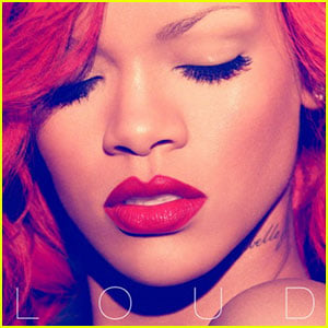 Each genre has elements to their digipacks which are specific to them, for example, pop artists usually feature a singular picture of the artist (most likely their face) as the cover where as rock bands will usually have some sort of design as their cover.
Generally the front cover with feature the artist name and album title, self titled albums just have the artist name. The back cover then consist of the included songs and then the record company, copyright etc.
The inside pages are generally lyric pages (a picture with the lyrics from an included song) however occasionally they show a sort of photo album or collage of just images of the artist.
Each genre has elements to their digipacks which are specific to them, for example, pop artists usually feature a singular picture of the artist (most likely their face) as the cover where as rock bands will usually have some sort of design as their cover.
Subscribe to:
Posts (Atom)