Thursday 1 May 2014
Wednesday 30 April 2014
Tuesday 29 April 2014
Tuesday 8 April 2014


Sunday 6 April 2014
Saturday 5 April 2014
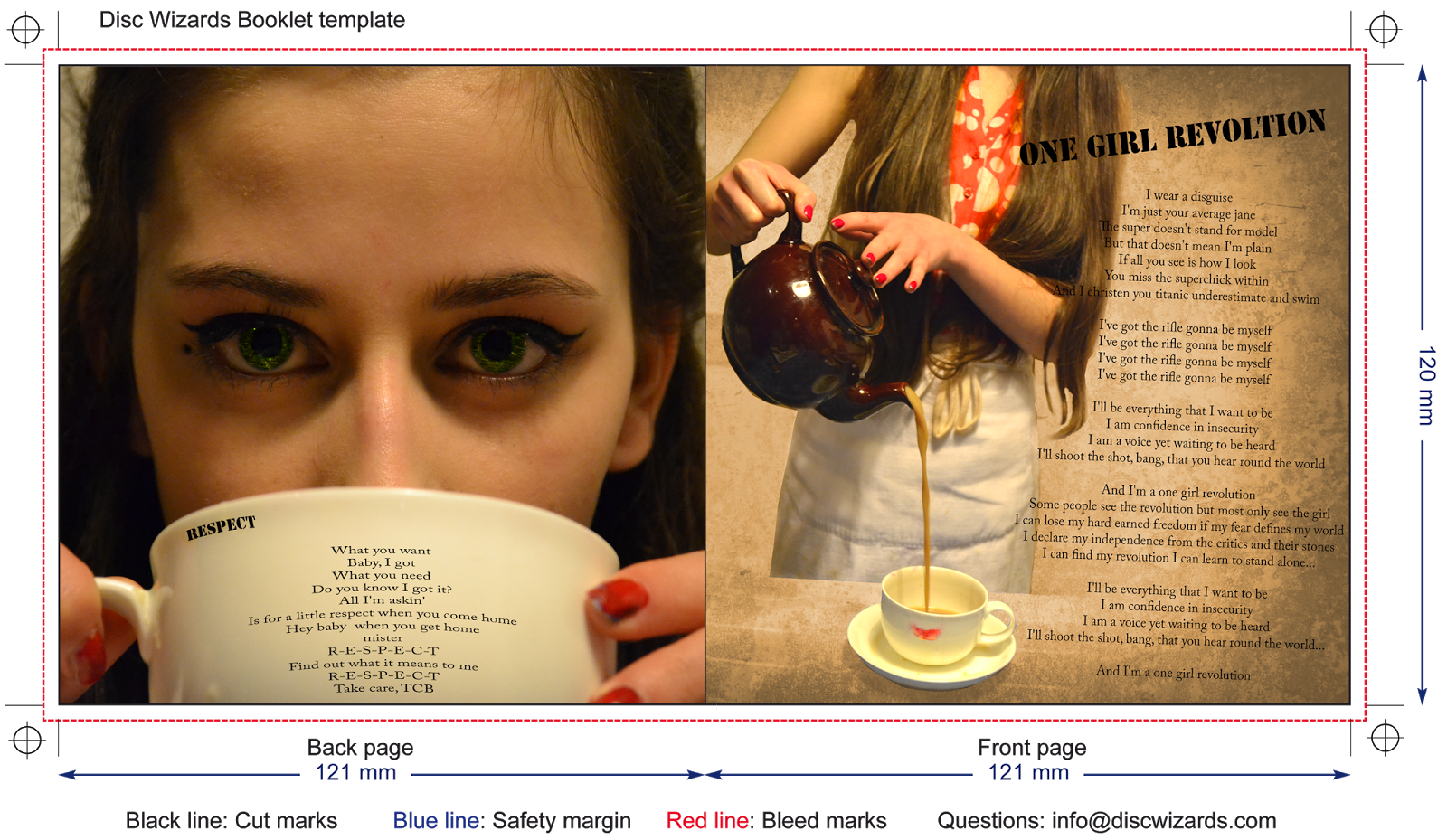
Final Digipak
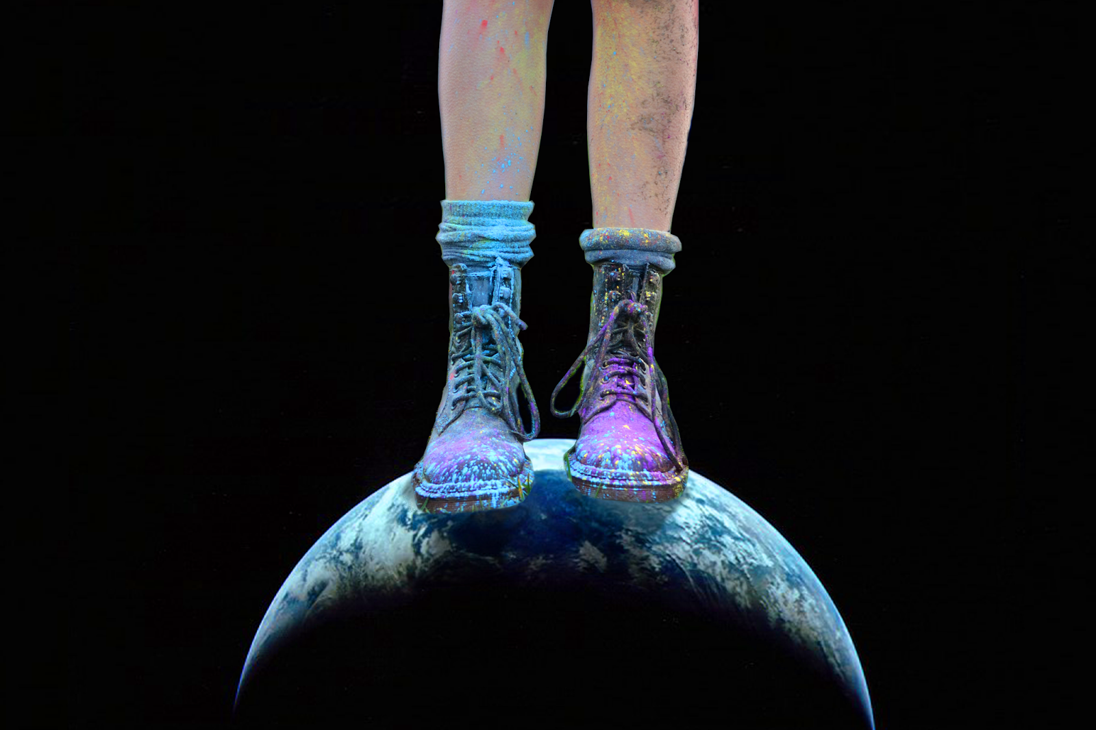
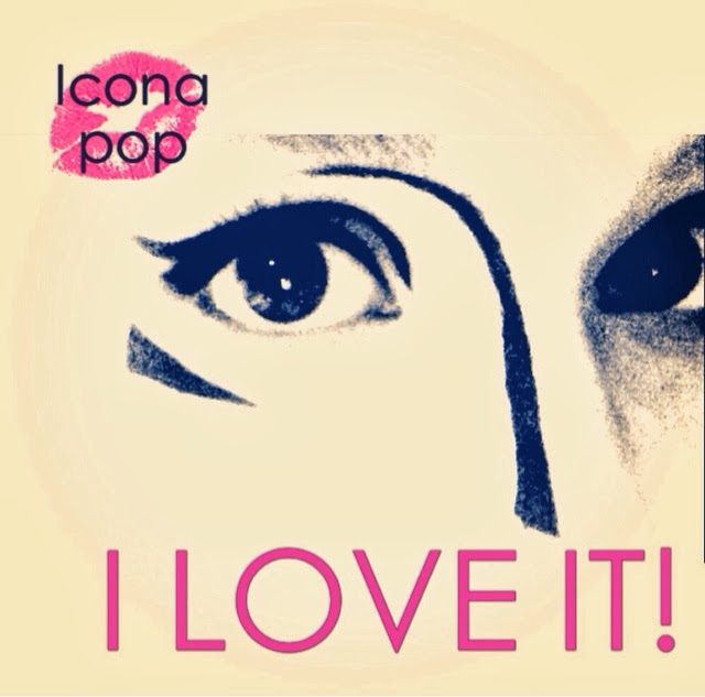
 For the front cover I sided on an image of the artist eyes inspired by the glow paint section of the music video. I thought this would be eye-catching and stick to the conventions of the pop genre of having a single picture of the artist. I feel the simply yet bright and colourful cover would be very effective, especially with the eyes as I feel they draw attention immediately. I then added what would be the logo for the artist - the paint splatter X - as this will feature heavily in the marketing campaign in the website and merchandise. The rest of the artists name I wanted to be imprinted into the cover (indented) to give the audience a draw to buy the hard copy as it has a little something extra, which was inspired by the holographic album art of Katy Perry's Prism. For the back cover I decided to use an image of the artists paint splattered boots (carrying through her grungy star image and the idea of not caring from the video) standing on the world. I thought this would link to the 'I am up in space' lyric from the video, I also then linked this to the name of her tour on the website of 'Out Of Space'. With the spine I have tried to connect the front and back covers by going in a gradient from black to white with 'Xena' going in and opposite gradient to help the name stand out.
 For the actual CD I decided to follow on with the idea of the paint and use an image of paint splatters which when over the center of the circle go slightly translucent, I also continued the indent idea by making the artist name on the disk engraved into the base of the paint splatter. The inside right of the case I want to just be plain white to follow the brightness of the whole digipak and also to match the back of the digipak booklet which is what would be seen when opening the CD case. This would also help to bring all of the attention to the CD as it is the only thing with colour.
The Front cover would act as the front of the inside booklet. The back of the booklet I have made plain white with just the company copyright. I thought this was important to keep the simplicity of the whole album and to not detract attention away from the CD. It is also a key convention of digipak booklets to have the back of the booklet just a plain block colour e.g. black however I chose white as this is the style of the marketing campaign as a whole (the website is white, front cover is white, music video is bright).

 For the inside images I stuck to three main themes from the video (the powder paint, London, and the opening). I made the first lyric page 'I Love It' and chose a photo of a shot from the music video. I then increased the saturation to make the colours brighter, I separated the artist from the background and then overlayed an image of light spots over the background to give the image more interest and brightness. Throughout the booklet I used the same title and lyric fonts to carry out the marketing.
For the second page I used and image from the opening sequence of the music video, I thought this contrasted nicely with the first page. To create the image I cut artist and tea cup from the back ground and then overlayed a darker image, I then played around with the colourisation until the background was sepia toned. I also increased the saturation of the artists red dress and nails to make the colour stand out more.
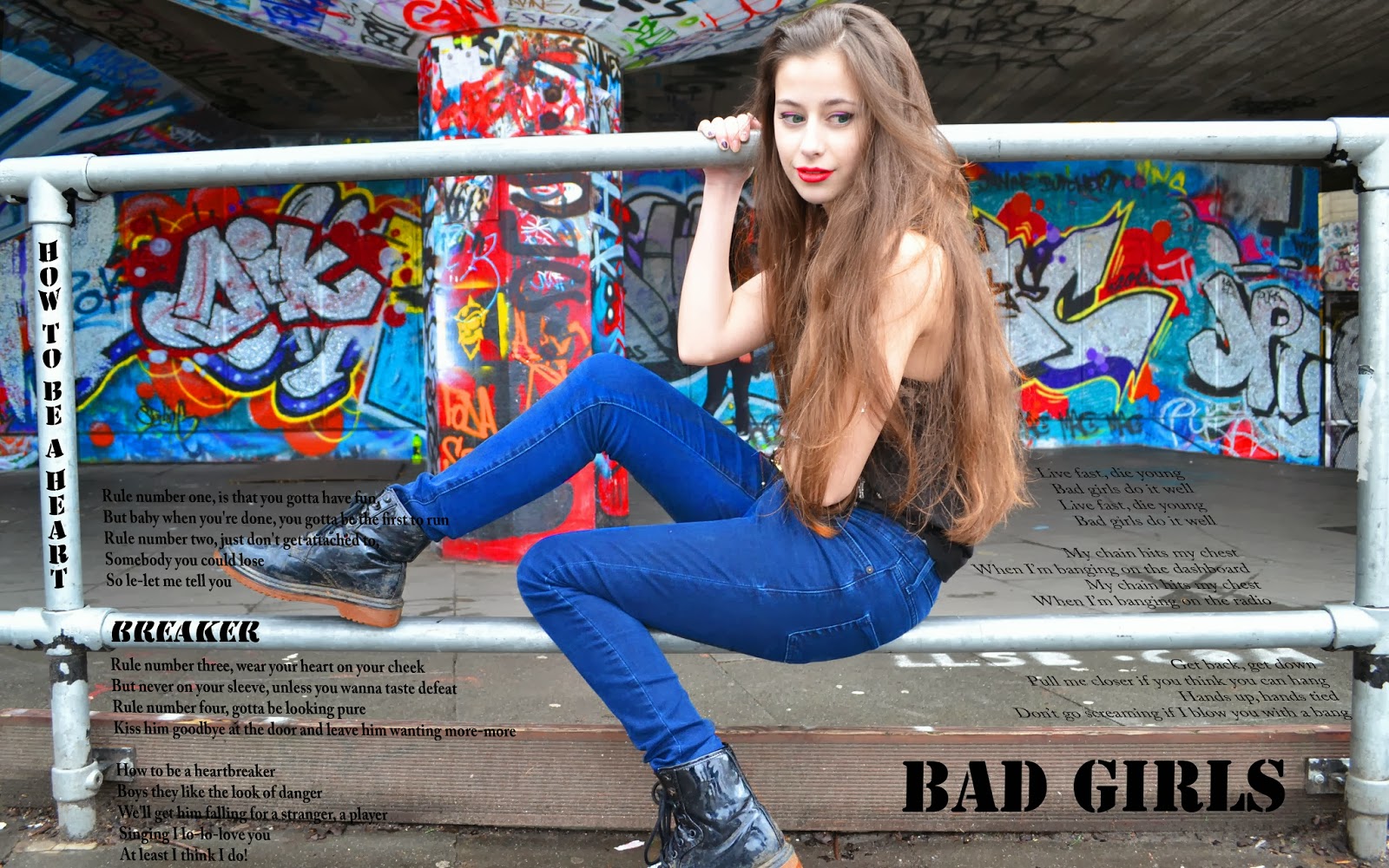
 For the center fold of the booklet I used an image from the South Bank skate park, for which I increased the saturation and for the graffiti, artists lips and jeans in order to make the image brighter. I also tried to make the lyrics look as though they were 3D, with the lyrics for 'How To Be A Heartbreaker' curving around the pole and following the direction on the poles; and the lyrics for 'Bad Girls' looking as though they are written on the floor and on the curb. I thought this would make the page look more visually interesting and not just be another boring lyric page.
For the 5th and 6th pages I went back to using the opening and powder paint photos. The 5th page I tried to continue the motif of the artist star image by using a close up picture of the artists face with all of the attention being on the eyes. To this image a overlayed an image of a rippling river over the iris' of the artists eyes to help capture the audiences attention and give some added interest to them. I then tried to make the lyrics look as though they were written onto the mug - continuing the style from the previous pages.
 The 6th and final page of the booklet I used two images - the background photo from filming the paint scene and the front image taken in front of the London eye which I cut the artist out of and overlayed on top. I moved the artist lips onto a separate layer, increase the saturation and put them above the overlay so that they would stand out the most in the picture. For all of the images I increased the brightness so as to follow the bright colourful motif of the entire marketing campaign.
 Wednesday 2 April 2014
Website
 Since my last website post I have decided to change the home screen. I have taken inspiration from the Lady GaGa website, using a similar colour scheme, echoing the image style with the faded out edges. Still sticking with the bright colours and image of the artist, however I have decided to make the background the front cover image as it is extremely eye catching and helps to promote the product, much like with Lady GaGa's website and many other websites in the pop genre.
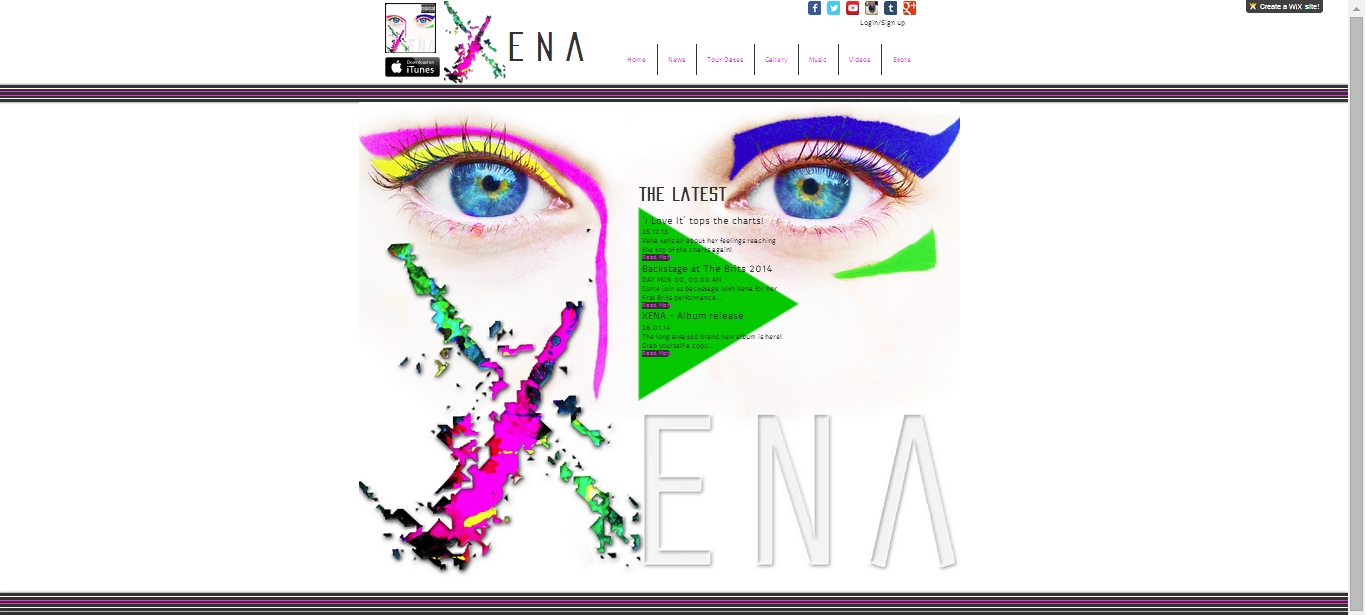

Monday 31 March 2014

Sunday 30 March 2014


Wednesday 26 March 2014
album art
Here is my progress on some practices of my back cover. I was thinking of doing the image above to link to the space theme or I was also considering just taking a picture of the back of the artists head. Since the front is going to be an image of her face, I thought this might indicate that the album is symbolic of the inside of her head - her thoughts and feelings. However, my worry is that a simple image of the back of the artists head might not be very visually interesting and people might not understand what it's meant to mean. Therefore I thought this image might be better as it is very striking and still links to all of the themes throughout.
Thursday 13 March 2014
Album Art

 |
| Original Image |
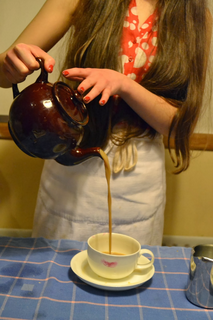
 Today I started working on the inside pages of my digipack starting with a picture of Katy pouring tea. I overlayed it onto a larger image in order to create space for lyrics, however I felt that the artist should not also be overlayed so I created a mask of the artist and the tea and overlayed the two photos not including the artist in a sepia tone. Then I felt that the artist should should stand out more from the filter so I made the mask of the artist remain in colour, I also tried to make the background a bit brighter as I felt the darkness of the picture did not fit the genre. I finally settled upon a faded brown colour for the background (to stick to the genre but to still portray the old looking style I wanted the photo to be in) I also feathered the mask in order to make it look a little more soft.


 I then worked on the other pages, repeating the mask of the artist style to make her stand out from the overlayed background, I also increased the saturation of the photo to make the colours brighter and more vivid especially highlighting the eye shadow and the powder paint. I then just added the I Love It lyrics in a simple style just to get a feel for what it would look like (I will most likely change the lyrics on this page later).
  I then added the lyrics to the second page choosing a song that I felt would match the somewhat girl power feel we have given to the artist, continuing the same fonts from the first page.
Finally I worked on a double page increasing the saturation of the graffiti, the artists jeans, lip stick, coloured eyeliner and eyes. I then added two songs which again I felt suited our artists image. I tried to make the title How To Be A Heartbreaker look as though it was written on the poles and the lyrics following the lines of the poles. Similarly I tried to make Bad Girls look like it's written on the step and the lyrics look as though they were on the ground. I thought this would help to make the double page look more visually interesting to the audience. I would say I am most pleased with this page, however there are a few things I should go back and fix just to make it look a little better (e.g. 'how' is curved incorrectly).
Wednesday 19 February 2014
Powder paint filming

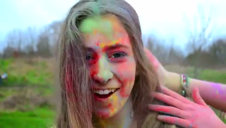 Today we filmed the powder paint scene. We did this simply in a park. We got more footage than we needed which will be good for editing as we will have a wide spread of shots to chose from. There were a few issues with light fading and rain, but we managed to get everything filmed and it was a lot of fun.
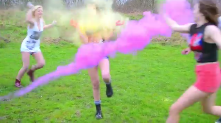
Tuesday 18 February 2014
Draft of website (progress)

Saturday 15 February 2014
Initial website design attempts

Thursday 6 February 2014
Progress - Editing
In today's lesson we continued doing the colourisation of our footage. Katy then had the idea to do a split screen for the London bikes jump cut scene. We did this by cropping and then adding colours to the shots. Toward the end of the video showing our process we discuss putting a boarder around each cropped shots to make it look more professional, we eventually worked out how to do this using the titles tools and drawing lines around the clips, this is fine as we are just working toward the rough cut, however, once we get onto final editing we will most likely find and use a different, better way to frame the clips.
Wednesday 5 February 2014
Progress - Editing
Colourisation
Today we started to edit the colours on the clips to make them stand out more and be more visually interesting. We played around with the saturation to make the colours more vivid, however this made the artist skin tone slightly orange. We continued experimenting with the colours using the three-way colour correction tool until we settled upon what we thought looked natural but still bold and bright.
Here is an example of the difference the colourisation has made so far. The first video being the original footage and the second being the edited footage. Overall I am pleased with the difference this has made to the footage however I think we could still work to further enhance the colours, especially in scenes such as the skate park to make the graffiti far more vivid than it already is.
Tuesday 4 February 2014
Ideas for album art

 Today I decided to start trying out ideas for the album cover. My initial ideas being a close up of the artists face, either eyes or mouth. The first one is just to get idea of the style and word placement, hence why it is a little dull. For the second image I then added some colour and lips, as a sort of logo. I thought this made it look a little more girly, however as our artist is meant to have a grunge style I thought this wasn't the right look for the artist
 I then tried out something that I thought might look a little more edgy, using a 3D effect on a photo of lips. I thought this created more a feel of the style I want, however I felt it did not look professional enough or close enough to the style of pop album covers.
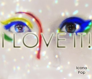 |
| 1 |
 |
| Original image |
 |
| 2 |
 |
| 3 |
 |
| 4 |
 |
| 5 |
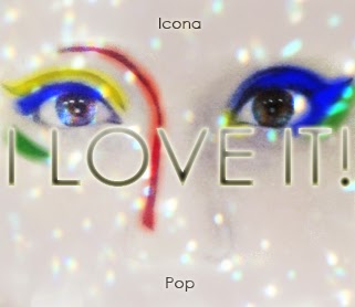
Finally I played around with the placement and boldness of the artist name a lot. the first change being from darker to a gradient. Then i moved the text to the upper left corner, and then split over the 'I LOVE IT!' title in the middle. Finally settling on both words together at the bottom.
Sunday 2 February 2014
pop websites research
Lady Gaga's website is typical of pop artists, promoting the latest album (background), keeping it bright and colourful (white and pink theme). However, the website does seem to be slightly behind in the codes and conventions of major stars as both Beyonce and Katy Perry had a more visual, photo based homepage and website in general. And so this is what it seems is the next step for pop artists websites to look like - visual, blog-like. Where as Lady GaGa's (who is a huge star) is still mainly writing.
Subscribe to:
Posts (Atom)