
Monday 31 March 2014
Sunday 30 March 2014


Wednesday 26 March 2014
album art
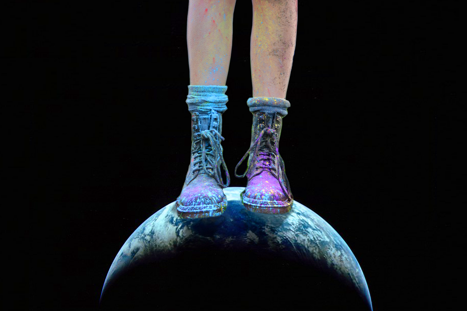
Here is my progress on some practices of my back cover. I was thinking of doing the image above to link to the space theme or I was also considering just taking a picture of the back of the artists head. Since the front is going to be an image of her face, I thought this might indicate that the album is symbolic of the inside of her head - her thoughts and feelings. However, my worry is that a simple image of the back of the artists head might not be very visually interesting and people might not understand what it's meant to mean. Therefore I thought this image might be better as it is very striking and still links to all of the themes throughout.
Thursday 13 March 2014
Album Art

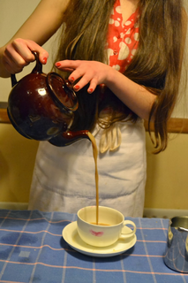 |
| Original Image |
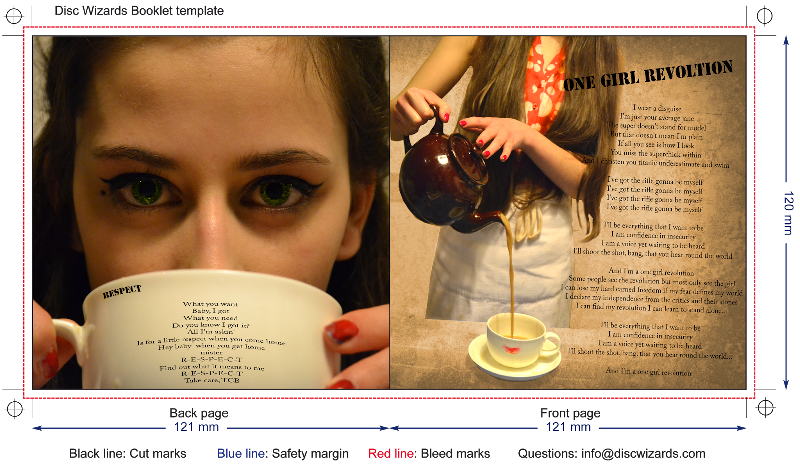
 Today I started working on the inside pages of my digipack starting with a picture of Katy pouring tea. I overlayed it onto a larger image in order to create space for lyrics, however I felt that the artist should not also be overlayed so I created a mask of the artist and the tea and overlayed the two photos not including the artist in a sepia tone. Then I felt that the artist should should stand out more from the filter so I made the mask of the artist remain in colour, I also tried to make the background a bit brighter as I felt the darkness of the picture did not fit the genre. I finally settled upon a faded brown colour for the background (to stick to the genre but to still portray the old looking style I wanted the photo to be in) I also feathered the mask in order to make it look a little more soft.


 I then worked on the other pages, repeating the mask of the artist style to make her stand out from the overlayed background, I also increased the saturation of the photo to make the colours brighter and more vivid especially highlighting the eye shadow and the powder paint. I then just added the I Love It lyrics in a simple style just to get a feel for what it would look like (I will most likely change the lyrics on this page later).
  I then added the lyrics to the second page choosing a song that I felt would match the somewhat girl power feel we have given to the artist, continuing the same fonts from the first page.
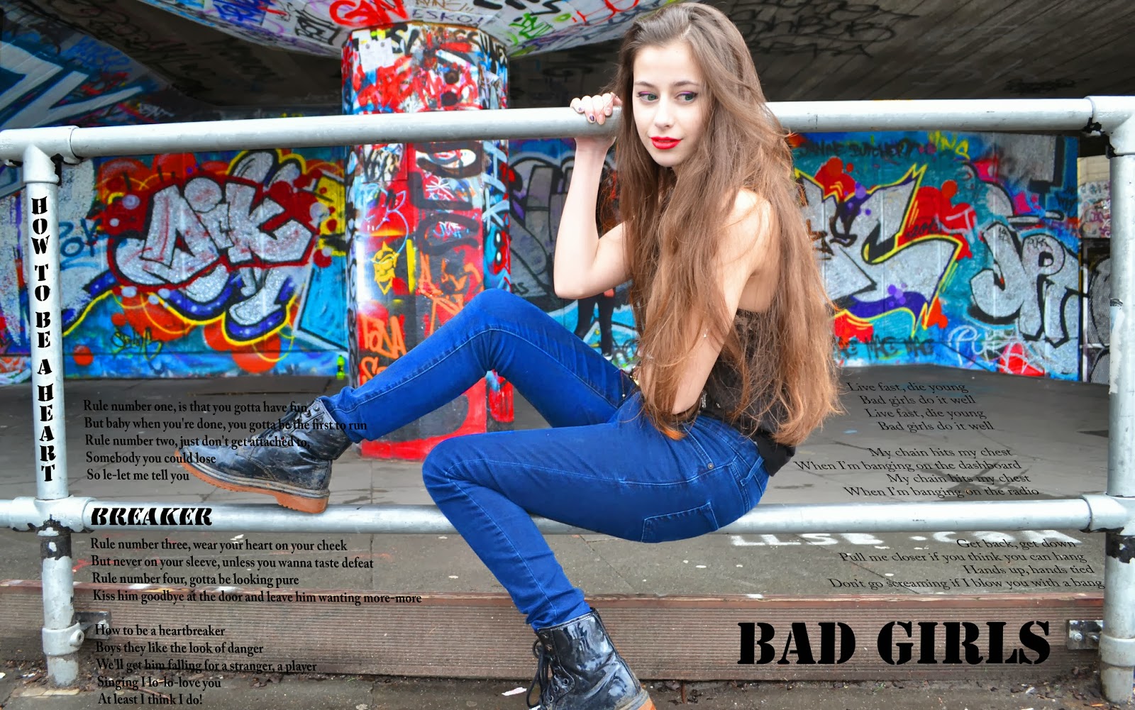
Finally I worked on a double page increasing the saturation of the graffiti, the artists jeans, lip stick, coloured eyeliner and eyes. I then added two songs which again I felt suited our artists image. I tried to make the title How To Be A Heartbreaker look as though it was written on the poles and the lyrics following the lines of the poles. Similarly I tried to make Bad Girls look like it's written on the step and the lyrics look as though they were on the ground. I thought this would help to make the double page look more visually interesting to the audience. I would say I am most pleased with this page, however there are a few things I should go back and fix just to make it look a little better (e.g. 'how' is curved incorrectly).
Subscribe to:
Posts (Atom)