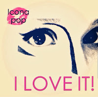

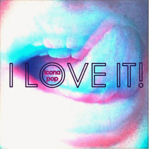
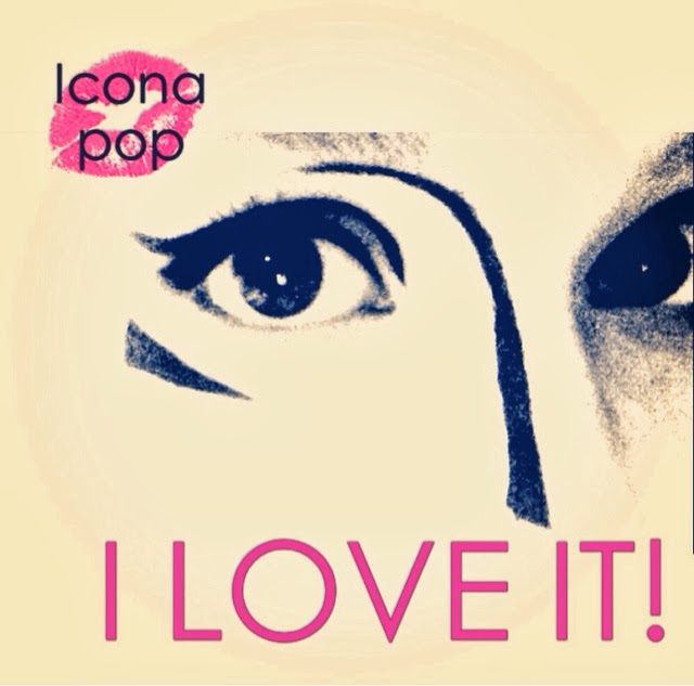
Today I decided to start trying out ideas for the album cover. My initial ideas being a close up of the artists face, either eyes or mouth. The first one is just to get idea of the style and word placement, hence why it is a little dull. For the second image I then added some colour and lips, as a sort of logo. I thought this made it look a little more girly, however as our artist is meant to have a grunge style I thought this wasn't the right look for the artist

I then tried out something that I thought might look a little more edgy, using a 3D effect on a photo of lips. I thought this created more a feel of the style I want, however I felt it did not look professional enough or close enough to the style of pop album covers.
 |
| 1 |
 |
| Original image |
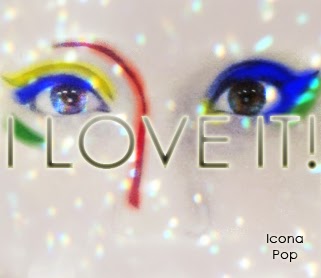
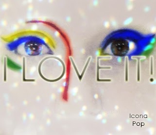
So I then started to try overlaying photos as this is what is usually done to create a more professional look. I also added colour to the eye make-up to try to sync it to the idea of the glow scene in the music video, thereby making it more of a combined marketing campaign than just an album cover. I then played around with text glow, which I thought helped to make it link into the photo rather than just looking like added text.
 |
| 2 |
 |
| 3 |
 |
| 4 |
 |
| 5 |
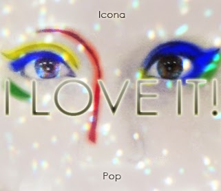
Finally I played around with the placement and boldness of the artist name a lot. the first change being from darker to a gradient. Then i moved the text to the upper left corner, and then split over the 'I LOVE IT!' title in the middle. Finally settling on both words together at the bottom.

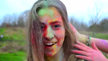 Today we filmed the powder paint scene. We did this simply in a park. We got more footage than we needed which will be good for editing as we will have a wide spread of shots to chose from. There were a few issues with light fading and rain, but we managed to get everything filmed and it was a lot of fun.
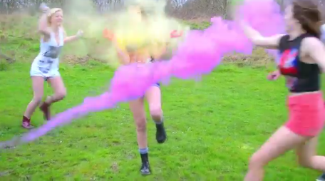


